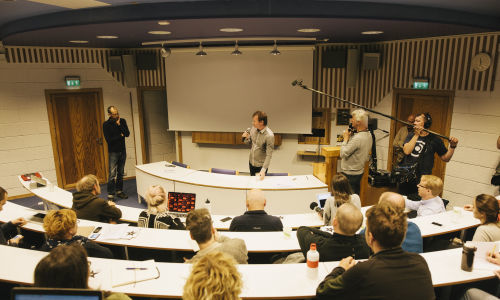
Changing Weathers visual identity
14. November 2014
Kirkenes, Kilpisjärvi, Riga, Amsterdam, Linz, Ljubljana
The Changing Weathers visual layout is based on different versions of a meta data font by defining the location the partners are based on.
On the website fonts are showcased when refreshing the page. In the end of the 2-year project the identity will be used more widely in the end catalog. The visual identity is is designed by Žiga Testen.


From the Book
-
Dark Ecological Chocolate
Timothy Morton
Dark ecology starts off dark as in depressing. Then it becomes dark as in mysterious. Then it ends dark as in sweet dark chocolate. In this lecture I'm going to provide an experiential map of dark...
-
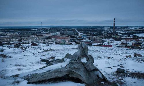
Nikel — The City as a Material
An interview with Tatjana Gorbachewskaja
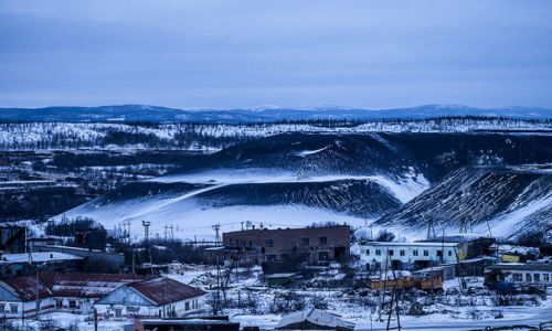
Tatjana Gorbachewskaja is an architect who grew up in the Russian town Nikel, located in the far North near the Russian border with Norway. For Dark Ecology Project she researched the materials of...
-
What Is Dark Ecology?
Timothy Morton
In this essay, which draws on his book Dark Ecology, For a Logic of Coexistence, Timothy Morton — who originally coined the term dark ecology — explains what dark ecology is. He also argues how...